The Agony and the Ecstasy: Booking a Trip with Hipmunk
“Travel Innovator Hipmunk Raises $15M” This headline from last week’s financial news caught my eye. Who is this Hipmunk and what kind of travel innovation does he (she?) provide?
Hipmunk is the brainchild of Adam Goldstein, 2010 graduate of MIT, and Steve Huffman, retired co-founder of reddit. Launched in 2010, the travel search site aims “to take the agony out of travel planning.” Where do I sign up? And why haven’t I heard of this before?
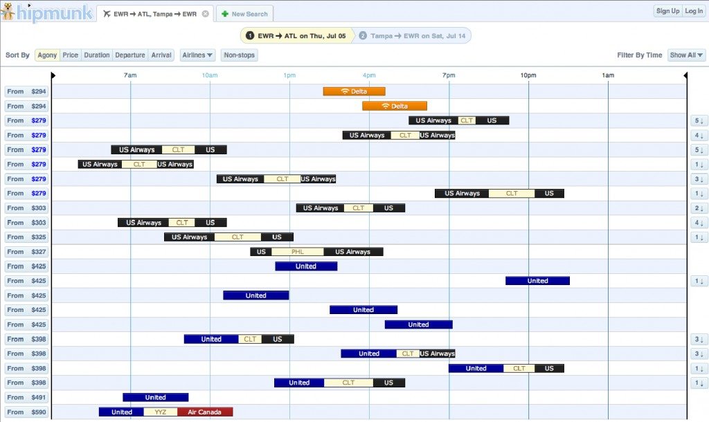
Apparently I’m not alone. I queried a few of my hipster friends and none of them had heard of the site, but they were curious to know more once I pointed out a few of Hipmunk’s features, primarily the presentation of search results in a timeline format integrated with your Google calendar.
I needed to book a trip for July so I decided to let the Hipmunk be my guide. Account setup allows you to indicate preferred airlines (but not hotel partners) to focus your search results and permit Google integration. The initial search screen is similar to those on Expedia or Orbitz or Kayak. While the search was loading, Hipmunk’s cute (but decidedly unhip) 
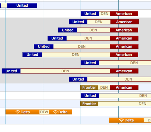
The graphic timeline is extremely helpful for choosing your flight. The airlines are color coded and indicate whether or not WiFi is available (but not meals?). You can fidget with the results until you find the flights that work best for you, including adjustable sliders that allow you to restrict times and prices. Flights with stops are clearly presented using boxes linked by the connecting city.

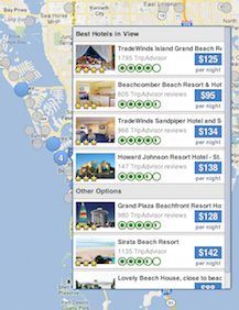
I then looked to the Hipmunk for assistance with my hotels. I needed three hotels in different cities. I’ve found this type of booking to be problematic on Expedia when trying to get a package price. Entering your destination and dates, Hipmunk returns results, color coded by price on a map. The results include hotels, but also options like houses and apartments available through Homeaway.

When you choose a hotel, multiple rates for rooms available through other booking sites (hotels.com, getaroom.com, etc.) are listed. I compared these rates to those available by directly booking with the hotels. The hotel’s prices were consistently lower. Hipmunk’s website also features a blog that primarily consists of excellent excerpts from Jodi Ettenberg’s Legal Nomads.

To broaden Hipmunk’s appeal, I would suggest promoting the excellent timeline feature, the TripAdvisor hotel reviews and the broad range of lodging options. A houseboat popped up in my hotel search. I would never have considered a houseboat, but once it appeared, I gave it some serious consideration. Leisure travelers enjoy this kind of “what if?” option. The feature I found most agonizing was the pricing issue with the hotels. This could be substantially mitigated if Hipmunk partners with major chains to allow direct booking rather than third party redirects. And I’d like to see an expansion of the capabilities of the personal account database. To store all of my hotel rewards and airline account numbers into a secure profile and avoid the agony of flipping back and forth to complete booking forms? Hipmunk – THAT would be travel ecstasy!
Which travel booking site do you use? What do you like most about it? What would you change? Follow The Open Suitcase on Facebook for more travel app reviews!


